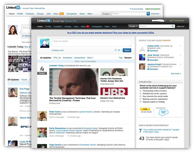
LinkedIn overhauled the look of its homepage on Monday, the end result of which is sort of a mashup of Facebook and Google+.
As on Facebook, the design has more relevant updates on top plus a comment stream that is set off with a different-colored (light blue) background. There’s also a line on top of the stream that shows which people — and how many — commented and liked the post.
However, the design is less cluttered than Facebook’s, making it more similar to Google+. The page also boasts a black band on top hosting headers like “Home,” “Profile,” and “Contacts.”
“This simpler and cleaner design makes it easier to navigate the page and quickly find the updates you’re looking for – whether that’s a news article your boss has recently shared or it’s to see who has just started a new job,” writes Caroline Gaffney, a product manager at LinkedIn, in a blog post explaining the move.
Here’s a look at the new design:

Here’s the old one:

What do you think about the new design? Let us know in the comments.
Via: Mashable


